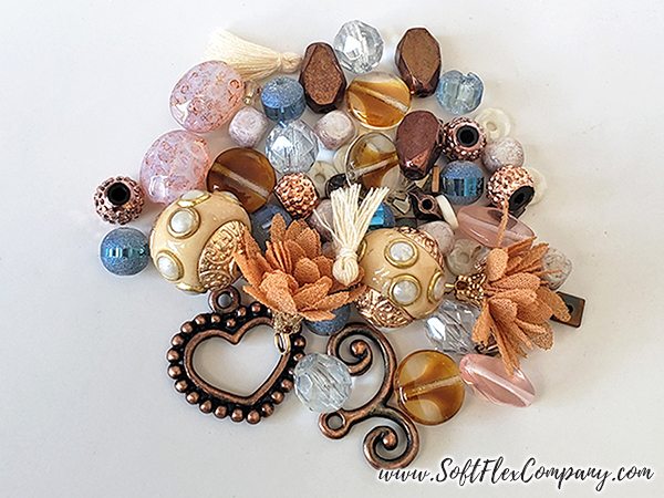
Color queens Margie Deeb and Beverly Ash Gilbert answer a single question about bead color. Asked how they work with a bead that does not match the color palette of the jewelry they intend to make, both ladies offer different and insightful answers. Working outside your comfort zone can put you into a unique creative phase. What seems like an artistic limitation can end up strengthening your talent. How do you work with color beads that do not agree with the jewelry you are designing?
We love Margie Deeb's intimate knowledge of colors and we wanted to re-share some of our archive articles she has written for us. Margie is an incredibly talented artist, designer, and author. Follow along on her color journey. Let's all become students of color!
Below, Margie discusses how she has designed jewelry that did not fit the color palette she had intended. She relates her jewelry experience to a music class she took. She was told to write music using only five notes. She found this to be a liberating moment as it forced her to explore creative areas she had never considered. Don't be afraid to face a difficult challenge, it will make your work stronger.
In their second joint "Ask the Color Queens" journal, Margie Deeb and Beverly Ash Gilbert feature a color-centric interview with Jamie Cloud Eakin, personal answers to your questions, and inspiring palettes to play with. Reading two points of view is fascinating, and since Margie and Beverly approach color from different backgrounds and viewpoints, you'll glean a lot of valuable inspiration from what they both have to say.
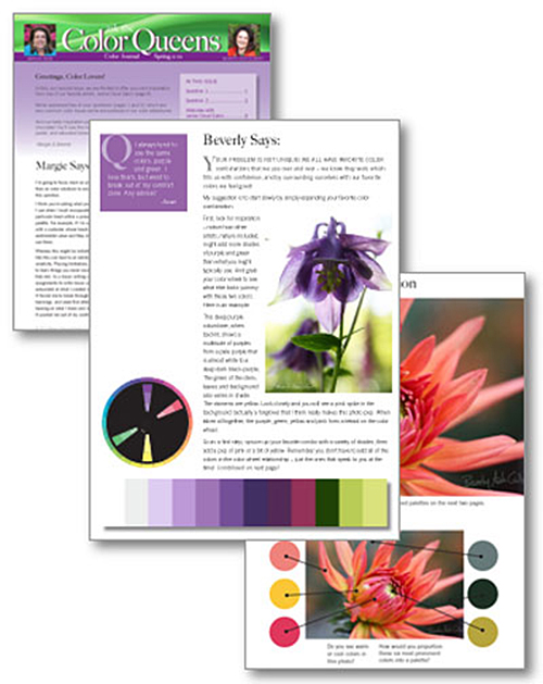
Here are a two excerpts:
Pam asks "How do you decide to go with a certain bead color when it does not really match the color palette you are trying to achieve, and it is a bit–or a lot–different from the rest of the beads or gems you hope to use?"
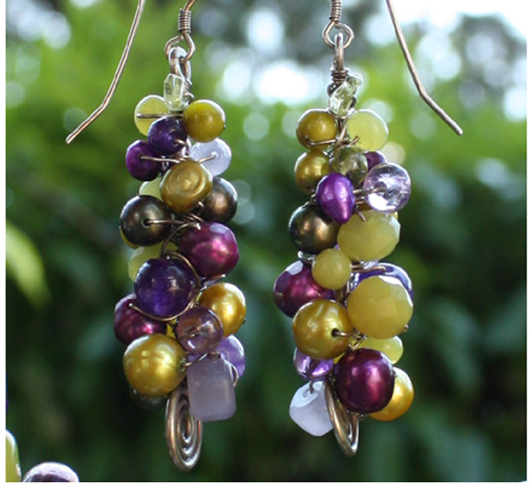
Earrings by Beverly Ash Gilbert
Margie says: "I think you’re asking what process I use when I must incorporate a particular bead within a prescribed palette.
For example, if I’m working with a customer whose beads have sentimental value and they insist I use them.
Whereas this might be initially frustrating, a challenge like this can lead to an exhilarating stretch of your creativity. Placing limitations can be a fantastic way to learn things you never would have explored if given free rein. In a music writing course I took, we had assignments to write music using only 5 notes. I was astounded at what I created with such a limitation. It forced me to break through assumptions, prior learnings, and weak first attempts. It forced me to stop leaning on what I knew and venture into the Unknown. It pushed me out of my comfort zone. I found the courage to leave the familiar and the convenient, and initiate a deeper state of creativity and newness. I learned more and had more fun than I thought possible using that restricted range of variables.
Approaching challenge with a spirit of adventure is the most important aspect of the process; far more important than the colors themselves. If your spirit is fully engaged, chances are you will resolve the issue wonderfully, or have a blast trying, or both.
Steeped in the excitement of “what can I learn?” I’d pull out my color wheels... all of them. I’d begin looking for a path, a direction that would offer coherence where I presently see none. I’d check out different geometrical configurations with some of the colors present in the bead(s) I’ve been asked to use..."
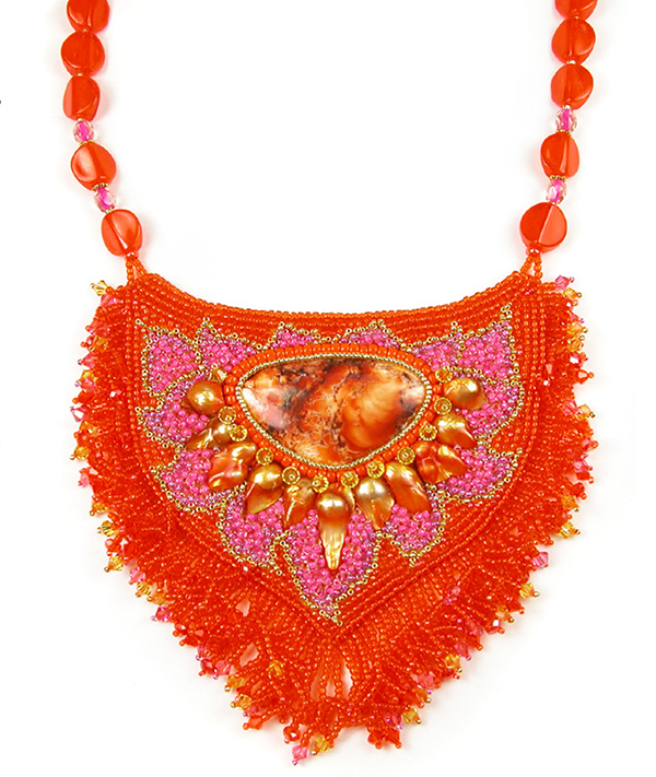
Necklace by Jamie Cloud Eakin
Beverly says: "This happens all of the time for me: I am looking for an exact color that I can see in my mind, but I just can’t seem to find it in the beads I would like to use in my piece. (Pursuit of exactly the right color is also why my bead stash has taken over our house!)
Depending on the project, I approach this challenge in different ways. If I am creating a piece with discrete beads, such as stringing, wire work or bead embroidery, I may have to give up a bit of my color control and go with something a shade darker or lighter or with a slightly different undertone (cool grey instead of saturated). But perhaps I am able to find a single accent bead in the color I want, it is just that the color isn’t available in the bulk of the medium I am using in my project. In this case, I will use that accent bead in a focal location, then work up to it in color on either side, or choose a darker background to make it pop. Here is an example of some lovely dichroic beads with an intense aqua that I might not be able to find without appearing too green or too blue. However, surrounding the accents with a darker, less intense shade, might actually make the accent beads pop more than they would have if surrounded by the exact match..."
Join our Facebook group – VIB. Stay in the know. Stay up to date. From our bead shows to our video shows and sales, you can stay in touch with us. The community is full of artistic and helpful beaders and crafty people. Inspire and be inspired. Share your pictures and get the beading bug from others!
Visit the Soft Flex Company YouTube Channel!

Artist and color expert Margie Deeb is the author of The Beader's Color Palette, The Beader's Guide to Color, The Beader's Guide to Jewelry Design and numerous beading and color publications. She teaches color and beading across the country and her free monthly color column, Margie's Muse, is available on her website. She writes regularly for Beadwork, Bead & Button, and Step-by-Step Beads magazines.


