

Color is so important if you love jewelry. Designing a necklace is more than stringing beads and gemstones. That is the basic part of our craft. To excel, you need to understand how a color beading wire is going to harmonize with the stones. You need to grasp how a spectrum of beads is going to look as the jewelry takes shape. You need to see beyond the technical part and plan how to make the colors sing.

Some people see color differently. While color can be easy to appreciate and grasp, on a fundamental level, there are people that have a much deeper understanding of it. It must be amazing to see the world through their eyes. Vibrant tapestries of color swathing through their daily lives. They have an intimate awareness of how color can blend and morph and be transformative. Margie Deeb is one such person. Margie has spent her life educating others about color. Read on if color is an important part of your life.
We love Margie Deeb's intimate knowledge of colors and we wanted to re-share some of our archive articles she has written for us. Margie is an incredibly talented artist, designer, and author. Follow along on her color journey. Let's all become students of color!
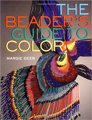
Parts of this are excerpted from The Beader's Guide to Color by Margie Deeb (Watson-Guptill, 2004, now Penguin Random House).
What makes a well designed piece of beadwork? How do you create a unified, harmonious piece so completely balanced and whole that nothing added or taken away would improve it? Emphasizing differences is one way.
Contrast is the opposite of concordance. A composition needs contrast because too much visual similarity becomes monotonous. Imagine if everything in your day-to-day life was the same shade of the same color. There would be few cues to help you make a visual distinction between your beads and, say, your lunch. We need contrast not only for visual distinction, but for pleasure: variety can add zest and delight to life. The more contrast you use, the more dynamic and energetic your work. If you like high drama, begin by emphasizing differences.
The major ways to create contrast among colors are by using differences in color properties: value (dark and light), intensity (dull and vivid), hue (the actual colors), extension (the physical amount of color used), and temperature. To create contrast, vary these properties of color. The easiest contrasts to discern are those of value and hue.
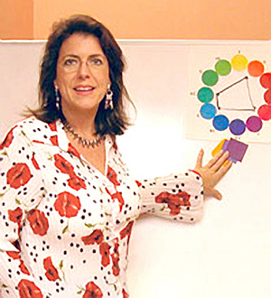
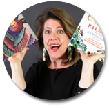
Margie Deeb Teaching
But don't limit your exploration of emphasizing differences only to the realm of color. Contrast basic design elements. Juxtapose straight lines against curves, diagonals against horizontals, blocks of color against spheres of color. String patterned beads next to solid colored beads and square shapes next to ovals.
Play with contrasting finishes and materials. Combine smooth beads with faceted, irregular, or chunky beads. Place shiny metallics next to flat matte finishes.
In single strand necklaces, a contrast in size piques interest. A strand of large, faceted amethyst chunks separated by spacers and seed beads is far more intriguing than a strand of amethyst beads that are all the same size.
Texture contrasts are both visually and tactilely fascinating. Everyone loves to touch fringe laden with different sized beads. Add texture to seed bead weaving by introducing larger beads, peyote ruffles, kinky fringe, or netting.
But be careful with contrast. Too many contrasting elements overwhelm and confuse the viewer. When exploring contrast, aim for balance and unity.
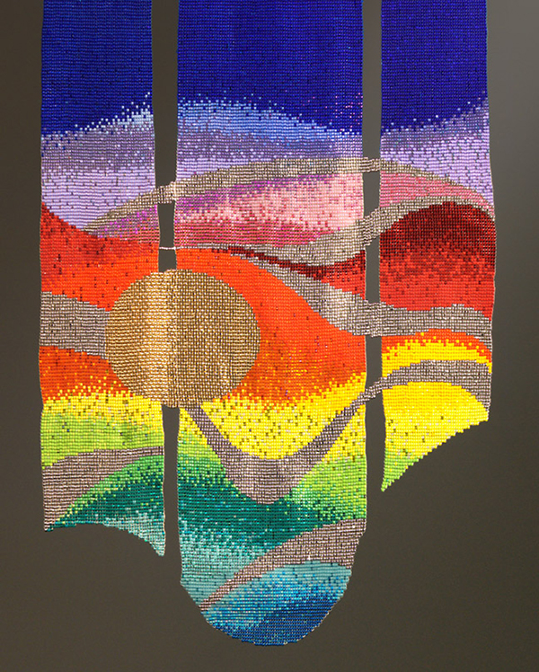
"That Silver Ribbon of Road", 2003
Design by Margie Deeb
(with weaving help from Frieda Bates)
I've emphasized hue difference in this tapestry: there are over 30 very different colors. The piece is exciting because of this emphasis on a wide array of vivid colors. It is unified by the colors sharing similar intensity.
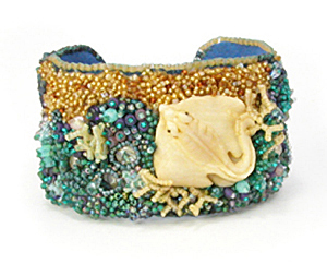
"Stingray", 2010
Design by Yoli Pastuszak
An emphasis on varied texture adds depth and intrigue to this bead embroidered bracelet. How dull it would have been had the artist maintained similar texture throughout the background.
Join our Facebook group – VIB. Stay in the know. Stay up to date. From our bead shows to our video shows and sales, you can stay in touch with us. The community is full of artistic and helpful beaders and crafty people. Inspire and be inspired. Share your pictures and get the beading bug from others!
Visit the Soft Flex Company YouTube Channel!

Artist and color expert Margie Deeb is the author of The Beader's Color Palette, The Beader's Guide to Color, The Beader's Guide to Jewelry Design and numerous beading and color publications. She teaches color and beading across the country and her free monthly color column, Margie's Muse, is available on her website. She writes regularly for Beadwork, Bead & Button, and Step-by-Step Beads magazines.