

Designing jewelry requires technical knowledge, creativity, and a little bit of love. It also requires an awareness of color. Color can turn a basic necklace into a piece of art. Knowing how to work with color will turn your jewelry designs into masterpieces. Last week, we published a blog by Margie Deeb that discussed the nature of contrasting colors to create stunning designs. This week we look at concordance. Concordance is harmony. Concordance is using similar colors to achieve an elevated effect.

Margie Deeb is a maestro of color. She has an intimate connection to color and is blessed with the talent of teaching. She is able to pass her knowledge on. Margie has spent her life educating others about color. Standing on the shoulders of giants is a great way to improve your knowledge. Margie's articles are well worth the read. Read on and learn how to add similar colors to your next necklace to enhance the design.
We love Margie Deeb's intimate knowledge of colors and we wanted to re-share some of our archive articles she has written for us. Margie is an incredibly talented artist, designer, and author. Follow along on her color journey. Let's all become students of color!
Parts of this are excerpted from The Beader's Guide to Color by Margie Deeb (Watson-Guptill, 2004, now Penguin Random House).
What makes a well designed piece of beadwork? How do you create a unified, harmonious piece so completely balanced and whole that nothing added or taken away would improve it?
Emphasizing similarities is one way.
Harmony is created when there exists a balance of similarities and differences. Whether the similarities and differences are of color, shape, size, texture, or movement, enough concordance and enough contrast must be at play to achieve balance and a dynamic tension.
Too many visual differences confuse the eye. What if every bead in the bead store were dumped into one huge bowl? Though enticing, the arrangement wouldn't be harmonious or well designed. Such a completely random mix offers delightful textures and colors, but provides no focused direction, and no place for the eye to rest.
After feasting for a moment on that random mix, your eye will spot all the bright yellow beads and begin grouping the yellows. You are seeking order. And you are finding order through concordance - colors (or shapes or sizes) that are similar.
The word "concord" means agreement, unanimity, harmony. I like to use "concord" and "concordance" when speaking of color because it corresponds to the word "contrast. And "contrast" is common in the lexicon of color. When using color we are always looking to balance cour levels of contrast and concordance.
The most obvious way to achieve color concordance is through hue; choose colors similar in hue. The three analogous colors, yellow, yellow-orange and orange, are concordant because they are similar in warmth and light, and sit next to each other on the color wheel.
Produce concordance by organizing colors of similar temperature, intensity, or value into well-defined areas. Burgundy and olive green are the offspring of highly contrasting colors, but they harmonize beautifully because of their similar low value and low intensity. Apply the harmony of similarities to movement, pattern, rhythm, texture, and shape by repeating and echoing some of these elements.
Be aware that if too many elements are too similar, your work will bore people (and yourself). When exploring concord, be it with color, shape, size, pattern, or any other element, add enough contrast to surprise and delight. We'll explore contrast in the March 2012 margie's Muse.) Aim for a balance of concord and contrast that creates beauty and unity.
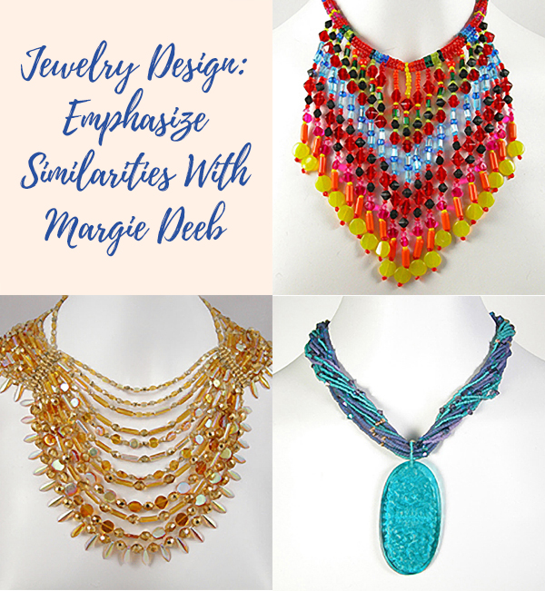
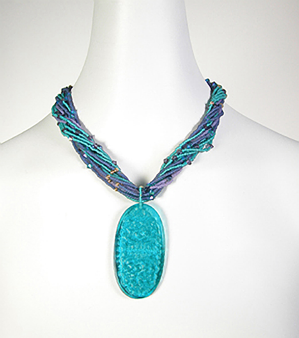
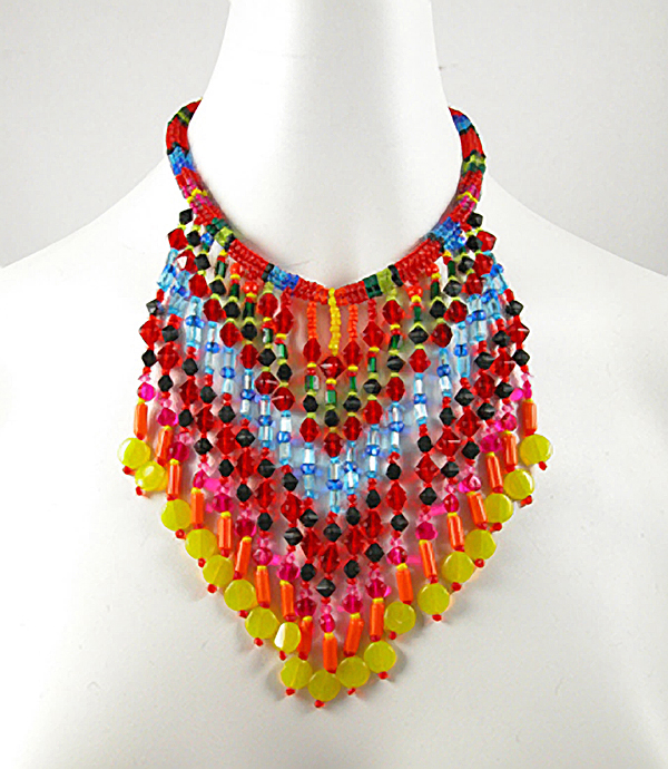
Varying levels of color similarity are used to achieve harmony :
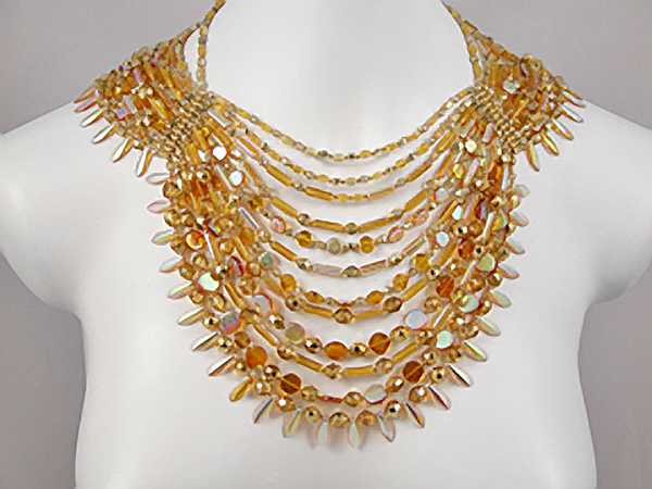
Same color
Necklace by Margie Deeb
Similar colors: blues and purples are analogous
Necklace by SaraBeth Cullinan
Similar intensity of different colors: all are bright and luminous
Necklace by Margie Deeb
Join our Facebook group – VIB. Stay in the know. Stay up to date. From our bead shows to our video shows and sales, you can stay in touch with us. The community is full of artistic and helpful beaders and crafty people. Inspire and be inspired. Share your pictures and get the beading bug from others!
Visit the Soft Flex Company YouTube Channel!

Artist and color expert Margie Deeb is the author of The Beader's Color Palette, The Beader's Guide to Color, The Beader's Guide to Jewelry Design and numerous beading and color publications. She teaches color and beading across the country and her free monthly color column, Margie's Muse, is available on her website. She writes regularly for Beadwork, Bead & Button, and Step-by-Step Beads magazines.