Do you like shortcuts? Today, Margie Deeb discusses a shortcut in jewelry making and art. But the emphasis here is on how using a shortcut can be a crutch and can stunt your growth as an artist. Today we will embrace color and personal progress and take the more difficult route. The journey of a thousand miles begins with a single step. Let's put our best foot forward!
We love Margie Deeb's intimate knowledge of colors and we wanted to re-share some of our archive articles she has written for us. Margie is an incredibly talented artist, designer, and author. Follow along on her color journey. Let's all become students of color!
Buy gold color beading wire without paying 24 karat gold prices! Pro Econoflex Hobby Beading Wire is an affordable and quality alternative for jewelry hobbyists. It offers our first and only .014 made with 49 strands of stainless steel. We are also offering .019 in 49 strands. Pro Econoflex Hobby Beading Wire is available in 2 colors and 2 diameters.
Below, Margie discusses how to avoid the easy path of using a black or white background when painting or creating beads or beaded patterns. Black or white is easy, but learning how to integrate a colorful background with a colorful foreground will make your work magical.
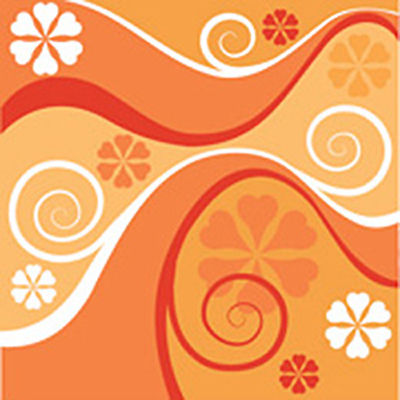
I’ve had students tell me that they can successfully use any colors they want in a composition as long as they place them all on a black background. I’ve heard glass bead makers proclaim a white background to be the answer to any color dilemma. The common stance here is that a white or black background ties together all colors in question.
In some instances this will work. But relying on black or white to pull together your palette will not nurture your growth as an artist, and will inhibit you and your self expression (and bore you all the while). If you use this or any other color formula, in all likelihood you're leaning on it as a crutch to prop up a weakness or a fear.
I find it much more fun to choose background colors from a sense of purpose, so that the entire troupe of color works together, each augmenting the best in one another.
The "ground," "background," or "field" you place colors upon is part of the palette, and needs to be thought of as such from the very beginning. It needs to be integrated. It may not be the largest area in a composition: your foreground colors may cover substantially more area than the ground. Or indeed, it may be the visually dominant color. Either way, approach the background as part of the composition, not an afterthought.
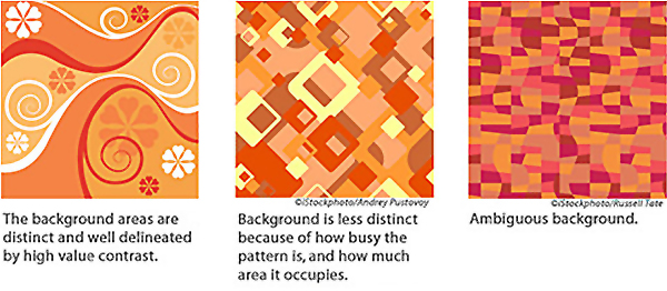
Often when you place a design or pattern on a background, you create visual clues to distinguish it from the background. In other cases you may deliberately choose to eliminate distinction between background and foreground. (Is a zebra black with white stripes or white with black stripes?) In the case of ambiguous foreground and background, the harmonious integration of the background color is all the more critical. The readability of a composition, or how clearly the foreground images can be seen against their background, is determined by high contrast in value (light and dark). The higher the contrast, the more readable the composition (think of that oh-so-memorable zebra pattern again). The more value contrast, the more visible the image.
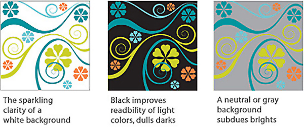
A white background give sharpness and clarity to any group of colors, even muted, soft tones and tints. Most museum walls are white for this reason. There's a sparkling crispness to colors on white.
Black backgrounds provide high contrast for light colors, and improve their readability. Light, pure colors-yellows and oranges-shine brightest when surrounded by black. Dark, pure colors like blues and violets look most colorful against white, but seem dulled when surrounded by black.
Neutral and gray backgrounds subdue the brilliance of pure colors.
To soften the effect of a design or pattern, reduce the amount of contrast between foreground and background. If your overall effect flattens out, lacking in depth or crispness, include contrast in small amounts. Add sparkle by introducing tiny bits of light or white. Add depth by using small amounts of dark or near-black. Small amounts high contrast will breathe life into a flat composition.
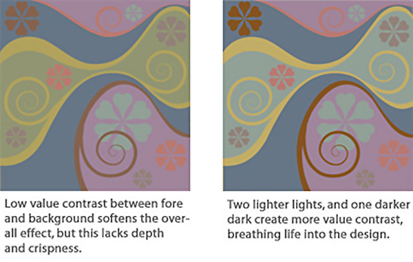
Whether your background is distinguishable from your foreground or ambiguous, its color needs to be a consciously chosen part of the whole palette. This brings unity to your palette, and can catapult it from ordinary to extraordinary.
Join our Facebook group – VIB. Stay in the know. Stay up to date. From our bead shows to our video shows and sales, you can stay in touch with us. The community is full of artistic and helpful beaders and crafty people. Inspire and be inspired. Share your pictures and get the beading bug from others!
Visit the Soft Flex Company YouTube Channel!

Artist and color expert Margie Deeb is the author of The Beader's Color Palette, The Beader's Guide to Color, The Beader's Guide to Jewelry Design and numerous beading and color publications. She teaches color and beading across the country and her free monthly color column, Margie's Muse, is available on her website. She writes regularly for Beadwork, Bead & Button, and Step-by-Step Beads magazines.


