How does the Pantone Color Institute forecast seasonal and trending colors? You might think they just gauge fashion. But that is only a part of it. Color forecasters explore everything. They follow graphic design. They track popular culture. They even monitor the health of society. To intimately know how colors may trend, forecasters watch elections, protests, and topical events that range from beauty to conflict. Color is truly a living, breathing organism. Forecasting requires a cultivated and astute mind. Let's explore!
We love Margie Deeb's intimate knowledge of colors and we wanted to re-share some of our archive articles she has written for us. Margie is an incredibly talented artist, designer, and author. Follow along on her color journey. Let's all become students of color!
Below, Margie discusses how color trends are not just about high fashion. Colors are liquid. They drift and flow with society, the economy, and current events. That wonderful green wardrobe you used to wear may have been inspired by environmental activism and not the runway. Learn how the colors you love have been informed by the world around you!

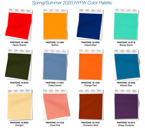
Twice a year I created the Color Report for Bead & Jewelry Designers. Within it's digital pages, by way of instructions, examples, proportion-specific palettes, and beadwork, I demonstrate how to work with the 10 specific colors that Pantone has forecasted.
How do the color forecasters at Pantone choose the seasonal colors? There's a lot more to it than you might think.
One of my readers in Canada directed me to "Q," a national arts and culture interview program on CBC Radio in Canada. I listened to a fascinating interview with color forecaster Keith Recker, who forecasts for Pantone and WGSN (an online trend forecasting firm).

Recker says "In forecasting we try to sniff out what people are thinking about, what they will be needing, what they are lacking in terms of psychology, spirituality, sociology, their economy, then we start to find our way into color."
"One of the factors that came into play when forecasting this time around is the U.S. presidential election cycle. Events from the the news (he refers to shootings) tell us it is going to be high-volume, high-conflict. A lot of people will be either embracing that conflict and wearing colors of protest: patterns that are graffiti-like and maybe a bit angry and maybe a bit lost, suspecting that our institutions might not be representing us appropriately. And other people will be having the opposite reaction: to find the most peaceful, least conflicting, most nourishing position away from all the conflict. Both of these narratives will have pretty specific color values associated with them."

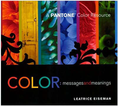
In her book Color: Messages and Meanings, Leatrice Eiseman, executive director of the Pantone Color Institute® writes "Don't make the assumption that all the new color trends come from fashion." She describes the influence the Apple iPod commercials had on color (remember the dancing silhouettes on brightly colored backgrounds). This is an example of color influence coming from the graphic design field. All the greens being used in the past decade have come from the emergence of environmentalism in the 90's.
As to the application of the forecasted colors and how to work with them, I've always encouraged my readers to use them as a starting point. You need not use the exact colors presented. Let those colors inspire you. Recker says "Use the forecasts as the beginning of the creative conversation. We put together these narratives and do our best to describe why the color palettes are relevant and perhaps how to use and combine them. Professionals take the forecasts and use them as the beginning of a process of tailoring the information in a way that's right for their product and their customer base. A fashion designer with a presence in a cutting-edge market will use the forecast in a very different way than a fashion house selling in the mass market, and the same thing [applies] in the home furnishing industry."
Join our Facebook group – VIB. Stay in the know. Stay up to date. From our bead shows to our video shows and sales, you can stay in touch with us. The community is full of artistic and helpful beaders and crafty people. Inspire and be inspired. Share your pictures and get the beading bug from others!
Visit the Soft Flex Company YouTube Channel!

Artist and color expert Margie Deeb is the author of The Beader's Color Palette, The Beader's Guide to Color, The Beader's Guide to Jewelry Design and numerous beading and color publications. She teaches color and beading across the country and her free monthly color column, Margie's Muse, is available on her website. She writes regularly for Beadwork, Bead & Button, and Step-by-Step Beads magazines.


