Let's learn about color! Previously, Margie Deeb has discussed individual colors. She has discussed how shapes and lines can affect color. She has discussed how color can complement and clash to create drama. If you want to make sure you are choosing the right color for your jewelry designs, make sure you follow our blog on Thursdays. Today we are going to learn about color values. Color values are the dark and light spectrum of color. How do values affect your jewelry? Read on to find out.
We love Margie Deeb's intimate knowledge of colors and we wanted to re-share some of our archive articles she has written for us. Margie is an incredibly talented artist, designer, and author. Follow along on her color journey. Let's all become students of color!
Below, Margie discusses how using color values – light and dark – can make a jewelry design or art piece visually exciting. If you do not recognize the necessity of correctly using values, your work can look washed out or plain. Values add drama!
I talk a lot about the importance of value in my classes and books. Value refers to the darkness or lightness of a color. Value is the most critical color property in building strong, effective color schemes.
Those who pay value no attention go straight for the luscious, delicious, enchantment of color (how can you fault them, it's so seductive). They forget to consider that the most important principle of making color harmonies work is the darkness and lightness of their colors relative to each other...and knowing how to arrange them.
Here's a way to consider value that I'll bet you never thought about: being conscious of the intervals of value within your color scheme.
Even intervals of value are more harmonious than uneven intervals. They are easy for the eye to distinguish, and they meet the human need for order. As long as each step is well distanced from the other (easy to tell apart and easy to see) you'll create a more pleasing effect.
This is much easier understood by looking at light and dark only with all hues removed. Look at the examples below.
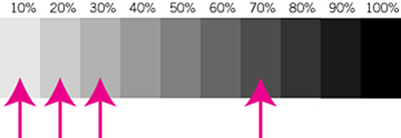

4 values are used in this design (see the pink arrows on the grayscale above). The intervals of 3 of the values are so close that they are not immediately distinguishable from each other. The last value is large step from the first 3, making an overall uneven stepped value scale.
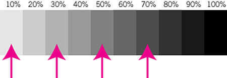
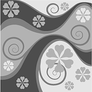
4 values are used in this design (see the pink arrows on the grayscale above). They are spaced far enough apart as to be easily distinguished from each other, and the interval steps are uniform. How do you like this design compared to the one on the above?
To apply this principle to color, you need a well trained eye for value, and must be cognizant of the value of each hue you are using.
My eBooklet, The Secret, offers lots of eye-training and insight into understanding how to use value. It is available for download from my site. I offer a one-day class exploring the issues presented by bead finishes.
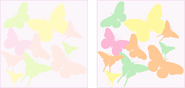
Image on Left: 4 values of one color are used in this design, but they are so close that they are not immediately distinguishable from each other.
Image on Right: 4 values which are spaced far enough apart as to be easily distinguished from each other, are used here. The interval steps are uniform. How do you like this compared to the one on the left?
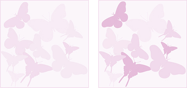
Image on Left: 4 values of different colors are used in this design, but they are so close that they are not immediately distinguishable from each other.
Image on Right: 4 values which are spaced far enough apart as to be easily distinguished from each other, are used here. The interval steps are uniform. How do you like this compared to the one on the left?
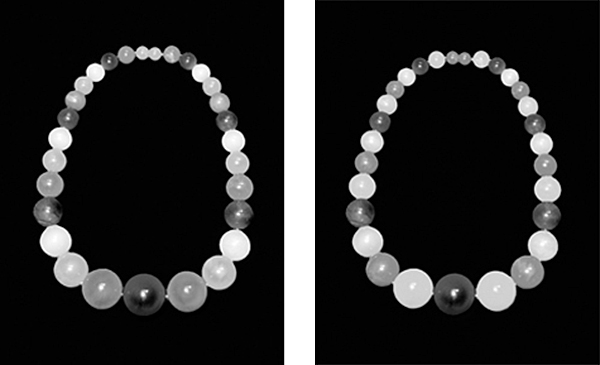
Value and Sequence
Values placed in natural order are the most pleasing to the eye: darkest to lightest, or lightest to darkest, as in examples on the left in which the beads are placed in sequential order by value, with the darkest bead in the center.
In example on the right the values are not sequential. The transition from bead to bead is more awkward and jumpy. The overall look is not as sophisticated. In some cases the effect may be desired, as with strands of festive Mardi Gras beads.
Join our Facebook group – VIB. Stay in the know. Stay up to date. From our bead shows to our video shows and sales, you can stay in touch with us. The community is full of artistic and helpful beaders and crafty people. Inspire and be inspired. Share your pictures and get the beading bug from others!
Visit the Soft Flex Company YouTube Channel!
Artist and color expert Margie Deeb is the author of The Beader's Color Palette, The Beader's Guide to Color, The Beader's Guide to Jewelry Design and numerous beading and color publications. She teaches color and beading across the country and her free monthly color column, Margie's Muse, is available on her website. She writes regularly for Beadwork, Bead & Button, and Step-by-Step Beads magazines.


