Do you know how the intensity of a color can affect your jewelry designs? Color intensity refers to the purity of a color hue. If a color has been saturated with a dark or light tone, it will change the intensity of that color. Intensity does not refer to the light value of a color, just the purity of the color. Sound confusing? Let's learn about how contrasting intensity can make your jewelry rich and dramatic!
We love Margie Deeb's intimate knowledge of colors and we wanted to re-share some of our archive articles she has written for us. Margie is an incredibly talented artist, designer, and author. Follow along on her color journey. Let's all become students of color!
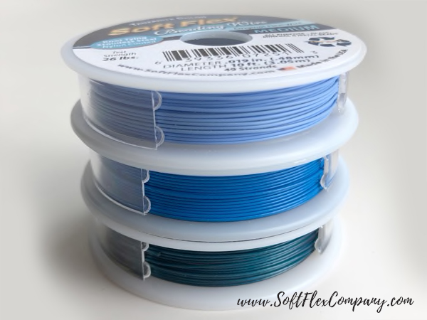
The colors Margie discusses in this blog are complemented with our Tranquility Trios Beading Wire Pack. Trios Wire is a lead-free beading wire for designers that want to create jewelry with color mixing in mind. Trios Color Wire Sets encapsulate the vivid palette of nature and the glamour of the fashion world. Trios Color Wire Sets are comprised of three 10 foot spools of Soft Flex Wire, the wire is constructed of 49 micro woven stainless steel wires.
Below, Margie discusses color intensity. Having a grasp of how beads of varying intensity can complement each other will make your next jewelry design much more vivid.
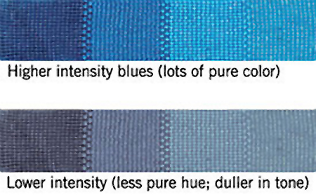
Learning to determine intensity of color will help you make beautiful color palettes.
The intensity of a hue refers to its relative purity or grayness. Intense colors are fully saturated with their pure hue. Less intense colors are less saturated.
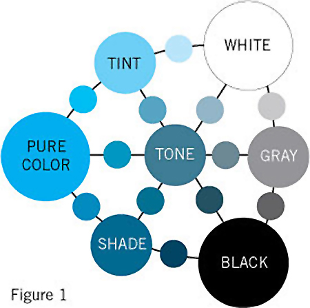
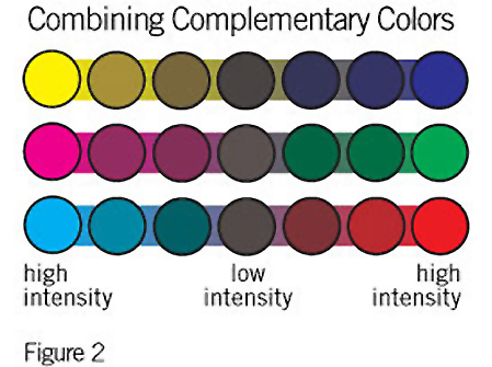
Low intensity colors are produced by diluting the pure hue in any of four ways. In Figure 1 you’ll see that adding white creates a tint. Adding black creates a shade. Adding gray creates a tone, rendering the hue more neutral and dull. In Figure 2 you can see that mixing a color with its complement generate very low intensity colors,because when mixed, complements neutralize each other.
Intensity is often mistaken for value. However, value is the relative lightness or darkness of a color. Value can influence the intensity of a color, but a lower value does not necessarily mean lower intensity.
In glass beads, the intensity of color is affected by three distinctive factors: reflected light, thread (or wire) color, and the color against which the bead is placed. For example, dark thread lowers the intensity of transparent, semi-transparent and even opaque beads. White thread used in the same beads increases their intensity, because more light and color is reflected back to the eye.
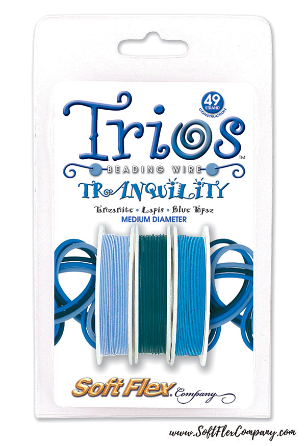
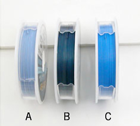
Let’s examine the relative intensities of the blues in the Tranquility Trios.
A, the lightest blue in the Trio, has a medium intensity. There is some of the pure blue hue in it, however it has been lightened, making it a tint.
Don’t assume B has the lowest intensity because it is the darkest. Look carefully and you’ll see that this blue is not only darker, but has less pure hue within it, therefore, it is the lowest intensity of the three.
C is pure blue, blue, blue! Nothing has been added to this fully saturated blue. So we can safely say it is the highest intensity blue in the Trio.
Contrasting low and high intensity colors produces sophisticated results. Bright colors stand out against low intensity backgrounds, particularly when the colors are complements of each other.
Contrasting intensities produces dramatic effects. High intensity colors come more alive. Low intensity colors can become rich and subtle. Practice stringing high and low intensity colors side-by-side and watch the colors shift. Study the effects of vivid colors woven into low-intensity palettes. What happens when you string orange beads on wire that is their complementary color: the blue Trio wires shown here? Depending on the intensity of the orange and the blue, either color, or both, will spark to life. What effect will the blue wire have within the orange bead if it is transparent? You’ll see a very low intensity, neutralized area of color where the thread passes through.
Join our Facebook group – VIB. Stay in the know. Stay up to date. From our bead shows to our video shows and sales, you can stay in touch with us. The community is full of artistic and helpful beaders and crafty people. Inspire and be inspired. Share your pictures and get the beading bug from others!
Visit the Soft Flex Company YouTube Channel!

Artist and color expert Margie Deeb is the author of The Beader's Color Palette, The Beader's Guide to Color, The Beader's Guide to Jewelry Design and numerous beading and color publications. She teaches color and beading across the country and her free monthly color column, Margie's Muse, is available on her website. She writes regularly for Beadwork, Bead & Button, and Step-by-Step Beads magazines.


